The Great Date Window Debate: Is Less Really More on a Watch Dial?
- Bryan

- Aug 8, 2025
- 4 min read
Watch lovers don’t always agree. That’s part of what makes this world of ticking hands and sweeping seconds so addictive. We argue about quartz versus mechanical, obsess over lug widths, and spend far too long wondering whether an exhibition caseback belongs on a dive watch. But one topic seems to split the room more than most: the date window.
Some see it as a practical touch. A little square of utility. Others see it as a design compromise, a blemish on an otherwise balanced dial. I fall firmly in the second camp. But before you roll your eyes, let’s give this a fair shake.
The Case of the Date Window
Date windows do have their merits. They’re useful. Genuinely. If you’re someone who works in an office, signs documents, or travels often, glancing at the date on your wrist is way more convenient than pulling out your phone. I’ll admit, I do it myself.
When thoughtfully integrated, a date complication can actually elevate a watch. Placement and design are everything. Look at the modern Breitling Navitimer, for example. The date window at 6 o’clock, often tucked neatly into a sub-dial, maintains the overall symmetry of the dial. It feels like part of the design, not something tacked on at the last second.
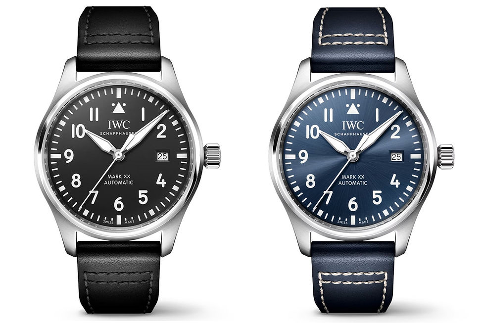
Or take the IWC Mark XX. That date at 3 o’clock? Perfectly counterbalanced by the 9 o’clock marker. The font matches, the color blends in, and the result is clean, legible, and deliberate.
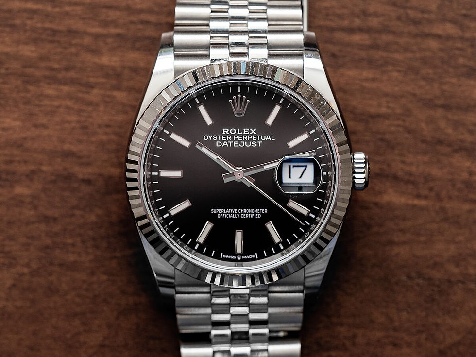
Let’s not forget the classics either. The Rolex Datejust, Omega Seamaster, and even many high horology pieces all feature date windows that millions of collectors appreciate. These watches aren’t broken. They’re iconic. There's heritage baked into the way these complications appear on the dial. It’s a nod to practicality that once genuinely mattered, especially in the pre-smartphone age.
But Let’s Be Honest… Some Are Just Bad
That said, not all date windows are created equal. On some watches, they’re about as helpful as a screen door on a submarine.
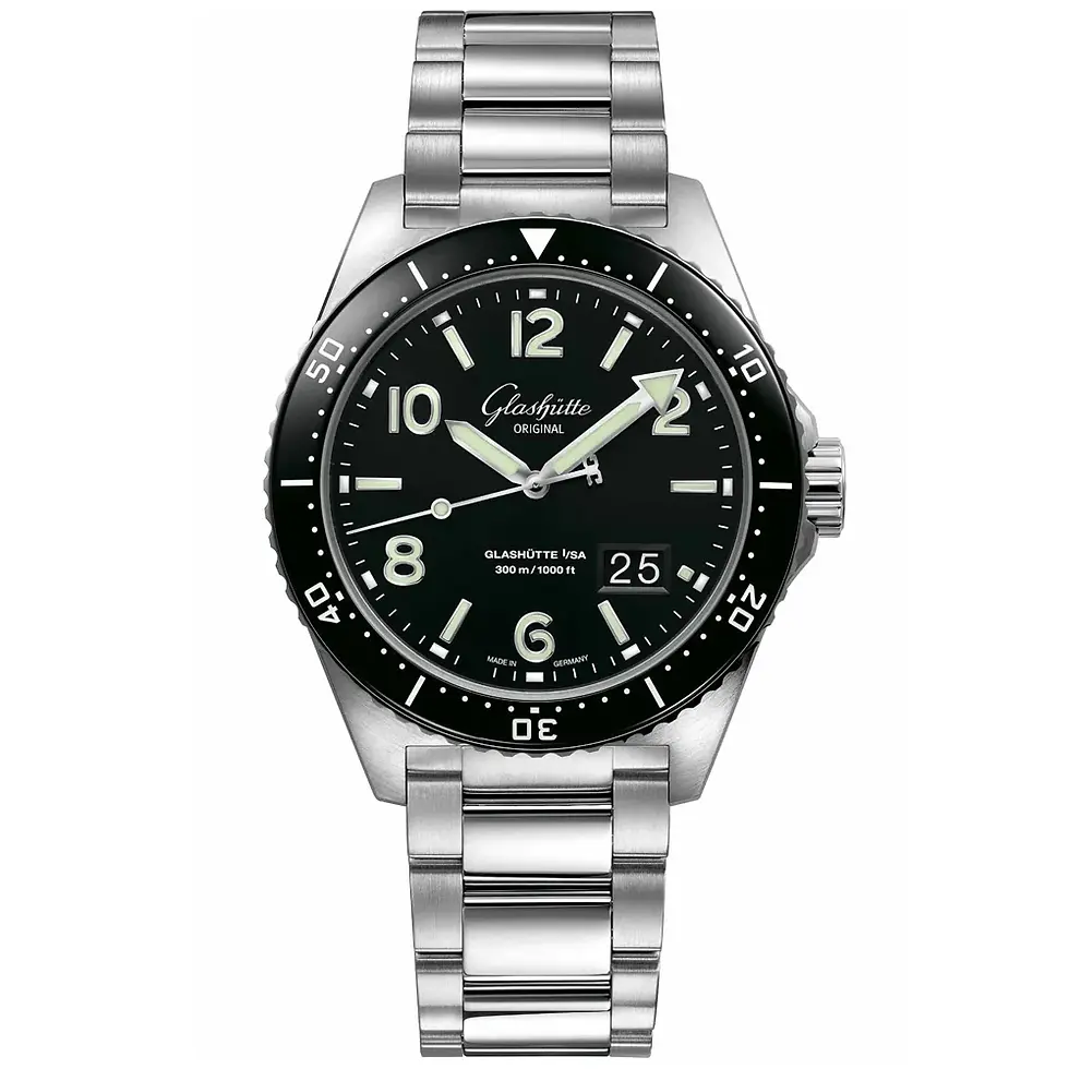
Take the 43mm Glashütte Original SeaQ. Beautiful watch. Superb finishing. But a large, unapologetic date window on a dive watch? While submerged 60 meters underwater? Come on. Nobody is diving with their SeaQ. That thing is more likely to see a wine bar than a decompression stop.
What we have in cases like this is a design flourish masquerading as functionality. And worse, it’s often a flourish that ruins what could have been a beautifully clean dial. A distraction. A visual speed bump.
The problem isn’t just the presence of a date. It’s how casually it's thrown in. Some feel as if the design team finished the watch, only for someone in marketing to nudge them and ask, "Where's the date?" Cue panic, and suddenly there's a square hole interrupting an otherwise sleek layout.
The Visual Argument
This is really what it comes down to. Visually, date windows often interrupt the natural rhythm of a dial. They throw off symmetry, clash with markers, and sometimes just feel like they were crammed in at the last minute.
And yeah, I’m looking at you, 4:30 date window.
This might be a tangent, but it’s the one that pushed me to write this article. Some brands, Zenith being a prime example, have started slipping the date window into the 4:30 position. It’s neither centred nor subtle. It doesn’t feel deliberate; it feels like someone designed a great dial, realized they forgot the date, and then just jammed it wherever there was space. It screams, “We gave up.”
Even Seiko and Citizen, brands I love, are guilty of this sometimes. Their otherwise excellent designs often fall victim to the "just one more feature" mentality. A no-date Seiko Alpinist? That would be a clean, elegant stunner. But instead, we get mismatched date windows and protruding cyclops cluttering up an otherwise gorgeous layout.
And do we really need the date on a hand-wound dress watch? Or on a reissue of a minimalist field watch? There are times when a date window feels as out of place as a digital clock on a sundial.
Why I Prefer the No-Date Life
At the heart of it, no-date watches just feel more intentional. More restrained. A clean dial allows the rest of the design to breathe. The symmetry is flawless. The balance feels meditative.
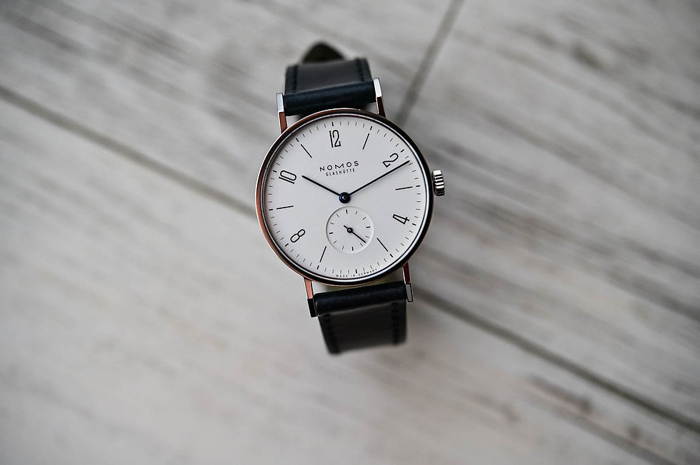
Without a date window, your eye is drawn to the hands, the markers, the subtle textures of the dial, the things that make a watch beautiful. It becomes a more focused, purer experience. Think about the Nomos Tangente. The dial is minimalist but sharp, crisp without being clinical. Imagine disrupting that flow with a stark, off-color date window. It would ruin the mood. Or look at something like the Tudor Black Bay 58. Part of the reason people adore it is because of how balanced and vintage it feels. It’s clean, timeless, and focused.
Even when I look at something as simple as a Hamilton Khaki Field Mechanical, I appreciate that there’s nothing unnecessary. It's just time, rendered plainly but beautifully. Nothing to distract, nothing to question.
There’s also something a bit romantic about it. A no-date watch isn’t concerned with productivity. It doesn’t ask you to check the calendar or remember the day. It just tells the time. There’s a kind of freedom in that, especially in a world that’s always pushing us to be more efficient, more connected, more "on."
And you know what? It’s not just a philosophical thing. It’s also about legibility. On smaller watches, especially, the date window often means squeezing the rest of the dial to make room. Numbers get cut off. Fonts get cramped. The result is neither clean nor useful.
In the End
Watches are emotional objects. That’s what makes this whole conversation worth having. It’s not about function versus form, or utility versus style. It’s about how a watch makes you feel when you glance at your wrist.
Do you appreciate the quick glance utility of a date window? Or do you prefer the stillness of a clean, unbroken dial?
There’s no right answer. But for me? The less clutter, the better.


I think it's fitting on some watches, but I personally think too many brands shoehorn the date when it isn't necessary. A Rolex Day-Date? A date makes perfect sense.
A Zenith chronograph with the date squeezed in at 4:30? Ehhhhh