The Lostock Standard: How a Duckworth Prestex and a Millenial Mom Cliché Saved My Sanity
- Joanna of Watch.Her.Tick

- Mar 11
- 6 min read
I was wrists deep in watches and watch pillows and a puddle of buyer’s remorse, Marie Kondo-ing my way through an eclectic collection, when a nagging thought made its way from the ether into my prefrontal complex: Do I actually have too many watches?
Since I was a child, albeit a weird one, sorting items by colour or style has been a soothing task but this, it was overshadowed by a combination of guilt, regret, denial, under a veil of self-unawareness. Numbers wise, let’s be honest, no one can have too many watches. I just don’t have all the right watches.
My lack self-unawareness comes from ignoring the mantra I tell everyone else when it comes to watch collecting or anything else really:
Does it spark joy?
Yes, I have ignored Marie Kondo’s wise words and the anthem of beige-mom’s everywhere. If you don’t know what a beige-mom is look it up…or don’t. I don’t want to dampen your mood with pampas grass and oat-milk-coloured tragedy.
Being a new watch collector is like being stuck in a Willy Wonka x Alice in Wonderland Pinball machine. Everything is fun and exciting and new; bouncing around between styles and brands and colours; just craving a taste of everything that’s out there. Throw in a healthy scoop of lack of self-control, and you end up where I was: Staring at decent sized collection but slightly confused. Less enforced serenity, more Oompa Loompa riddles.
While the Pintest girlies were busy curating their main-character energy powder rooms with bold botanical wallpaper and gold trimmed apothecary jars, I was hoarding lume like a squirrel preparing for neon winter. I realized my watch boxes were less curated grid of intentional elegance but more of a horological hoarders wet dream, just pinning anything with a bezel and a pulsation scale.
I looked at my collection of shiny objects – essentially a hoard of impulse-buys curated by an overly-stimulated magpie- and found horological quiet when I looked at the Duckworth Prestex Lostock.
Duckworth Prestex Lostock: Inner-Peace

Unlike the rest of my hoard, which was largely the result of questionable impulse control, the Lostock wasn’t a one-click conquest. I had first seen it at the Toronto Time Piece show, and while the over-stimulated magpie in my brain was busy adding everything to a virtual cart, the Lostock just…sat there. It haunted my subconscious for months, the persistent tick of British refinement that refused to be drowned out by the horological background hum of a ‘new watch release’ Instagram algorithm.
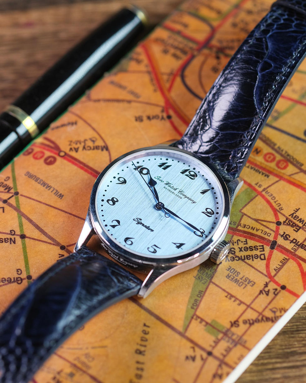
When I first locked eyes with the Lostock, it wasn’t the polish of the beads-of-rice bracelet that tuned out the chatter – it was the numerals. These Bolton numerals, as the brand calls them, are a glorious Venn diagram of Art Deco swagger and Breguet-style elegance. They look like 16th century calligraphy just had too many double-espresso shots, made an entrance and is about to unapologetically correct my grammar.

This is a watch with font-based personality – a dash my grandfathers handwriting that I could not stop thinking about.
Then there’s the dial. In a sea of basic-bitch-blue – the kind of flat predictable one that populates every starter collection line-up – the Lostock is a palate cleanser. The main dial is a crisp icy blue, behind a sapphire crystal, that acts as a stable environment for those overly-caffeinated numerals. But the real magic? The bright sub-dials. They aren’t just white circles; they have a fine, speckled, effervescent texture that’s difficult to pin down. Like a micro-fizz frozen in time or high-end artisanal stationary under a microscope.
The dial and numerals may be the old souls of the watch but the red accents are the mischievous streak that keeps the whole thing from sinking into horological monochrome hell. They are a high-visibility middle finger to the polite and monotonous aesthetic of other chronographs; the pop of colour a tailor hides in the lining of a grey suit – it makes the whole thing feel alive.
To top it all off, there is a date window at six o’clock. In a world of ‘haphazardly-shoved-at-four’ dates that ruin a watch’s flow, this vertical symmetry is a shot of pure dopamine for my neurodivergent soul. It brings a level of geometric peace to the dial that makes my brain stop itching. While my other impulse-buys were screaming for attention with high-gloss finishes, the Lostock played it cool with this organic depth and a blue that doesn’t care if it matches your outfit because it knows it’s the most interesting thing in the room.
The Lostock uses a BGW9 lume – while the numerals fade into the shadows, the hands erupt into a crisp, ghostly blue; a luminous blueprint of a watch that was worth the months of mental residency. Those electric blue blades cut through the dark like a surgical instrument with a vintage throwback.
Beyond the lume, there’s the physical reality of the 40mm stainless steel, round case. For a brand famous for its vintage-inspired squares, this is a deliberate departure – it’s not the usual cushion case you’d expect from the Duckworth lineage. At a crisp 13mm thick, it is a masterclass of compact restraint. It manages to avoid the dreaded “wrist brick” aesthetic, sliding under a cuff with the kind of ease my impulse-buys can only dream of.

But, the real tactile “spark” comes from the chrono pushers. These aren’t those sharp utilitarian stubs, they are adorable little rounded mushrooms that feel like they were stolen off a 1940’s dashboard. Each soft click is not just about timing a loaf of sourdough; it’s a perfect mechanical handshake.
And just in case I forgot that this watch has a sense of humour, there is the adorable caseback. Protecting the Miyota quartz 6S21 movement and providing a 200m water resistance – to survive a deep dive, or in my case, a very enthusiastic dishwashing session – is the Duckworth mascot. A literal duck, embossed in steel, staring back at me. Quack. I’ve spent years complaining that modern watches have casebacks as soulless and vacant as a ‘Live, Laugh, Love’ sign in a rental cottage. But, not the Lostock – quack.
The finishing touch is the beads-of rice bracelet. It is the horological equivalent of a weighted blanket – pure comfort with a side of vintage swagger. Tragically for the watch nerds currently discovering the brand, it seems to be no longer available on the new models. It is a study in contradictions: the polished center beads catch the light with a dewy glow, while the brushed side links keep the whole thing from looking like an Insta glam filter. It all culminates in a fold-over clasp that offers one final, delightful jump-scare: surprise, another duck. Quack quack.
This bring us to the man behind the waterfowl: Neil Duckworth. There’s something undeniably cool about a brand that isn’t just a faceless conglomerate’s attempt at ‘heritage.’ Neil didn’t just ‘manifest’ a brand over a matcha latte; he resurrected his family’s 1920’s legacy – the original Prestex – with the kind of British grit that makes my ‘saved for later’ graveyard look extra pathetic. This is the difference between buying a vibe and buying a bloodline.

But the real human plot twist here isn’t just the history; it’s the man himself. Speaking with Neil is a dangerous treat - not unlike those provided by that sociopath Wonka – he is so genuinely kind and engaging that you find yourself wanting to talk to him forever, probably about anything except dial colours and water resistance. In an industry often defined by gatekeeping and main-character egos, Neil is the refreshing outlier who makes the experience feel entirely personal.
It was the human connection, paired with those eccentric Bolton numerals and a refreshing blue dial, that finally turned a three-month slow-burn brain-itch into a purchase. He wasn’t just selling me a watch; he was handing over a physical, ticking spark of joy and a piece of living heritage.
The Lostock became my new metric. From now on, if a potential purchase doesn’t spark that giddy feeling and slightly increased heart rate as this watch does, it’s a hard pass. Will I get rid of some of my old watches that don’t meet the aggressive aestheticism standard? No, I don’t actually regret buying them - they’ve earned their keep, horological exorcism avoided; it’s all part of the journey. But I’m not collecting watches anymore; I’m curating a whole vison board mood. Some of it may even be beige.
Jo from @watch.her.tick is a typical watch nerd with an extremely healthy dose of sass, strong opinions, and vibrant colors. Perhaps that is not so typical after all. You can find her on her Instagram where she regularly shares photos of watches, as well as delightful and relatable memes.


Great read! To be honest had to look up the Beige mom thingy! Love the photos of the watch too